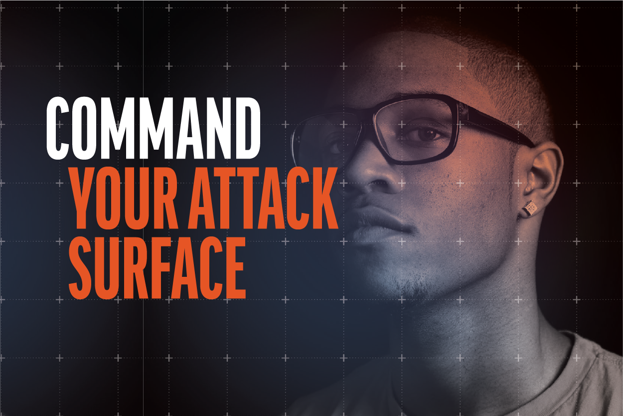
Rapid7 is a global cybersecurity company whose brand had become fragmented over time, with multiple teams producing creative assets without a consistent visual direction.
As lead for the in-house design agency, I worked closely with internal stakeholders and the design team, overseeing the development and rollout of the new identity across design, motion, web, digital and marketing assets.
The rebrand created a stronger, more cohesive brand presence while providing teams with the tools and frameworks needed to scale creative execution.
We defined the brand personality and key characteristics, providing a foundation for a complete rebrand. The rebrand covered everything from typography, colour, motion graphics, photography, and image treatments to templates for Google Slides, Docs, InDesign, and Figma. This approach delivered a consistent, creative, and scalable brand identity across all touchpoints.
Below are pages from the brand guide, showcasing the new graphic treatments, typography, and visual principles. The refreshed identity shifted the brand towards a bold, modern interpretation of the Sage archetype, balancing expertise and authority with clarity and approachability. These guidelines ensured consistency while giving designers the flexibility to create engaging, creative and recognisable Rapid7 design solutions.


Booth design at BlackHat
I led the creative direction and design for a double-height booth at BlackHat, one of the industry’s most prominent cybersecurity events.l in the new brand style.
My goal was to create a visually distinctive presence that stood out in a sea of competitors. The result was a striking, immersive booth experience that amplified brand visibility and engagement.
Beyond the booth structure, I collaborated with our interactive designer as well as getting hands on and creating motion graphics for the large-scale ‘mega screen’ and developed event merchandise—ensuring every touchpoint brought the Rapid7 brand to life in a cohesive, dynamic way.


Brochure design
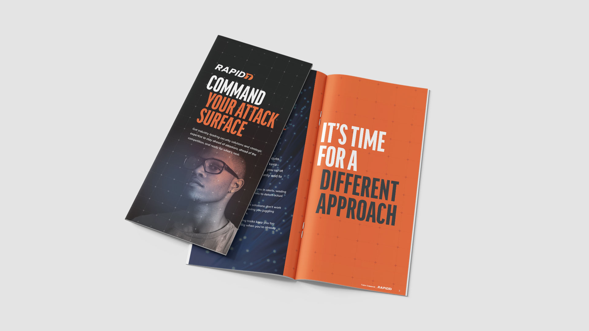
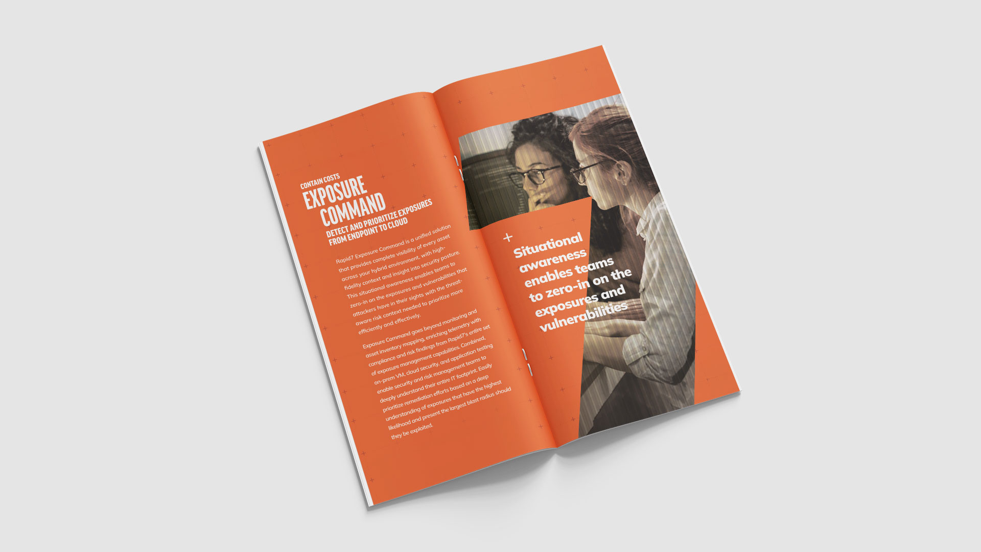
Following Rapid7’s brand refresh, I designed this brochure to bring the updated visual identity and messaging to life across a key marketing asset. Working within the new brand guidelines, I applied the refreshed typography, colour palette, and graphic elements while creating a clear, engaging layout that effectively communicated the content. The finished brochure helped establish consistency across customer-facing materials and showcased the updated Rapid7 brand in a polished and professional format.
PACT Partner program social media animation
Rapid7 launched its PACT Partner Program to strengthen relationships with its partner network. Working alongside a copywriter, I created a 15-second social animation in After Effects, transforming the campaign messaging into a concise and engaging visual story. Designed specifically for organic social channels, the animation was crafted to capture attention quickly, communicate key messages efficiently, and maximise impact within the feed.
