At Infosecurity 2024, Europe’s premier cybersecurity event, Rapid7 sought to make a memorable impact with a standout booth. Collaborating closely with the marketing manager, stand builders, and the VP of Marketing, I crafted a design that seamlessly integrated elements from Rapid7’s office environment and showcased their new ‘Take Command’ campaign. The result was a visually striking and cohesive booth that captured attention and effectively communicated Rapid7’s brand and message amidst the bustling event.
Role: Creative direction, Lead design
Here are some pages of the mock up book, which was used to share the design across internal stakeholders;
April 06, 2021, Tuesday
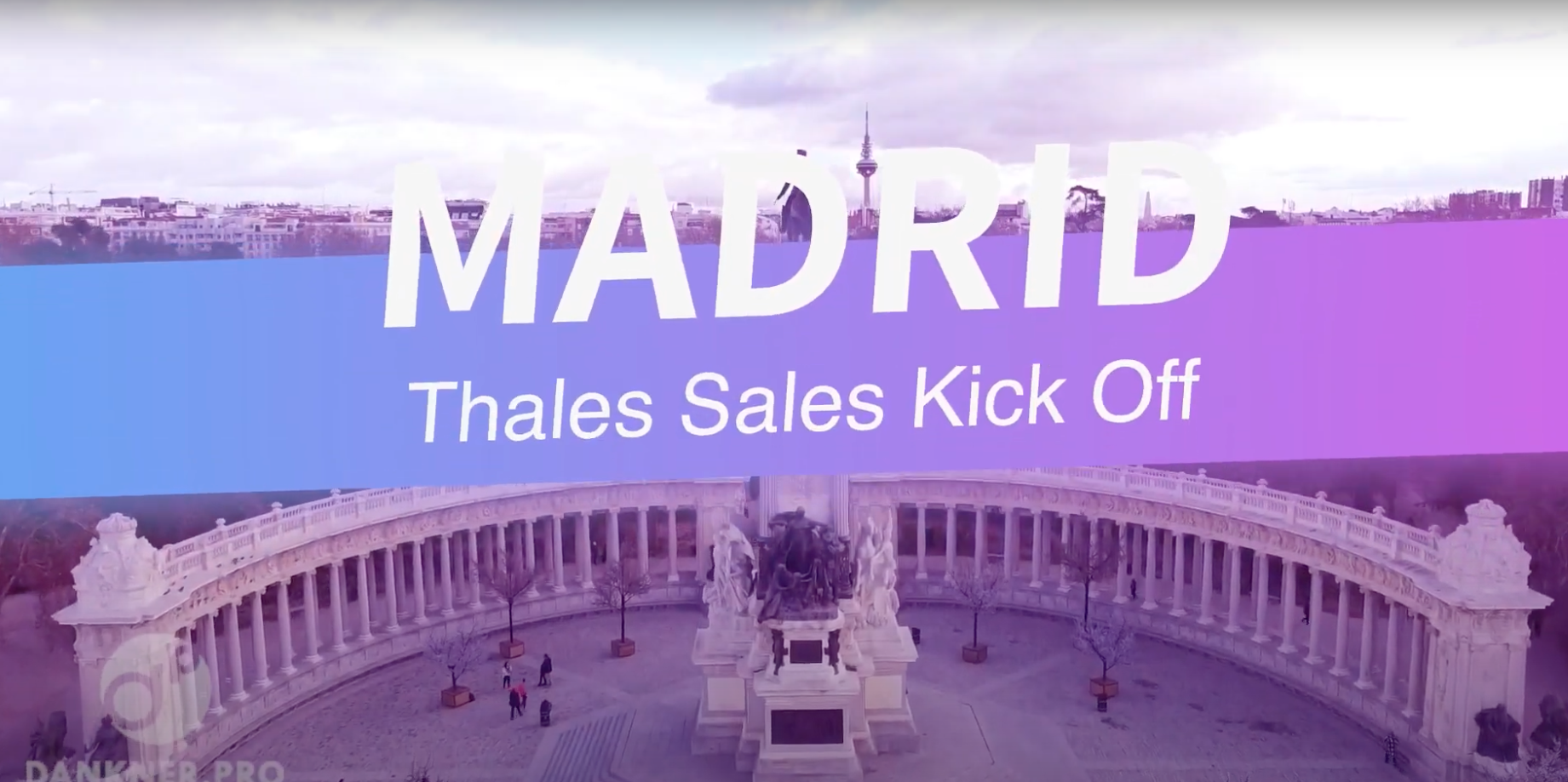
Thales Sales Kick Off Branding
Brand design
Creative direction and Lead design
Brief
Create an annual event that works alongside the Thales brand that can be repurposed year after year with it’s own unique identity.
Results
I led the inhouse design team and created a new identity for the 2023 sales kick off and applied to 3 global events. It was applied to all visuals across the event ranging from app graphics, presentations, venue graphics to promotional. I pitched the design concepts and worked with multiple senior stakeholders and internal design team to bring the brand to life.
Here is a showreel of the EMEA event showcasing the branding and highlight event.
December 08, 2020, Tuesday
UX / UI audit and redesign
UX / UI
Role: UX / UI design
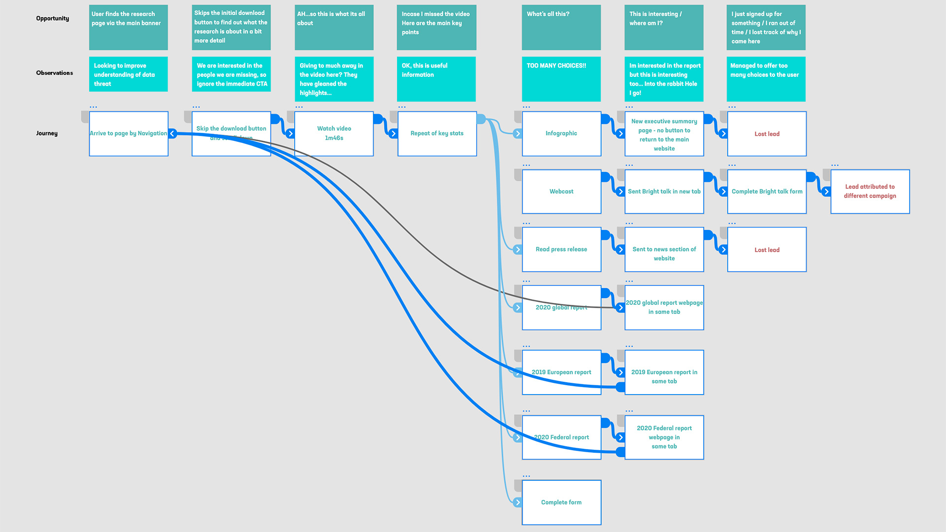
Increase engagement on the research web pages of the Thales corporate website.
Research
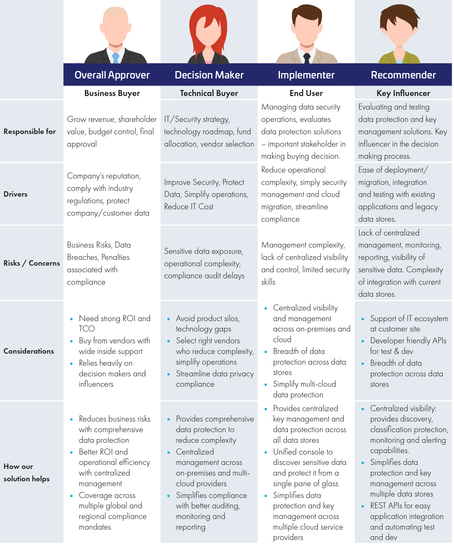
Before assessing the existing performance of the page and performing a UX audit, I identified 4 user personas that would access the site;
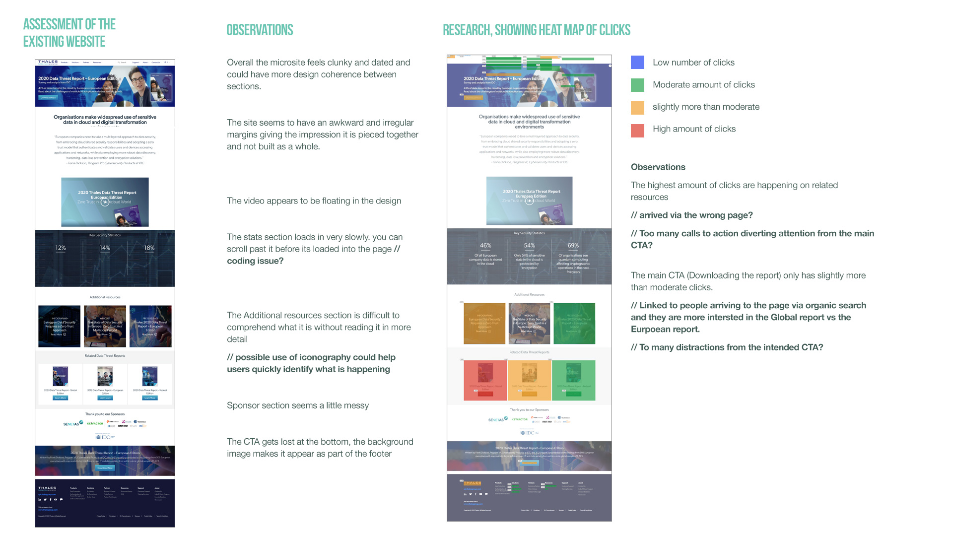
We then analysed the page using Hotjar and mapped out the different user journeys. We quickly identified that there were multiple routes off the page as soon as you entered it. It became clear that the focus of the page needed simplifying and organising in a way that would lead the customer through a journey in a structured way, to a clear CTA. I started by making a list of observations on the page based on some stats from HotJar:
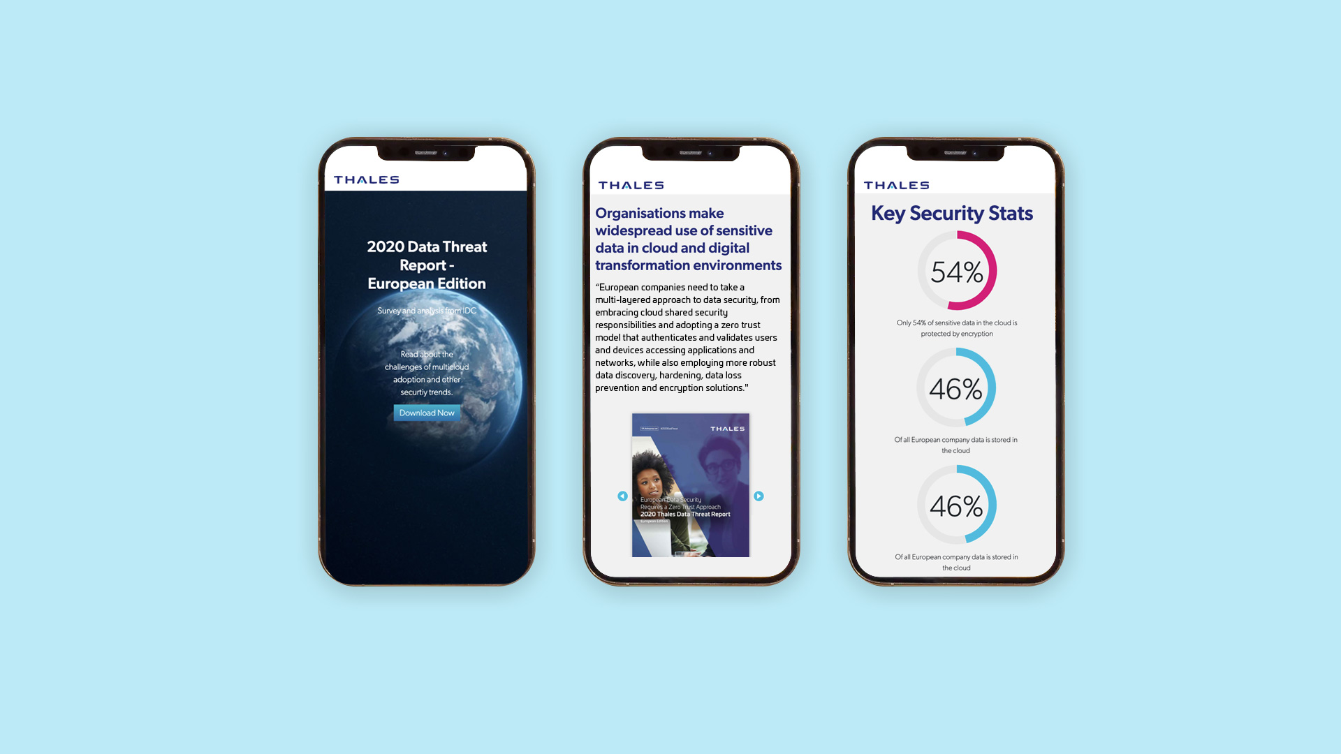
To improve engagement on the page, i designed an animate-on-scroll banner, so as you scrolled down the page, a short animation would lead you through the contents. Other highlights included a amazon style flip book of the first few pages of the report, to tease people and incentivise them to download the full report and infographic style stats that would animate on load. All this was created in the most efficient way to keep the page feeling quick and nimble
September 24, 2020, Thursday
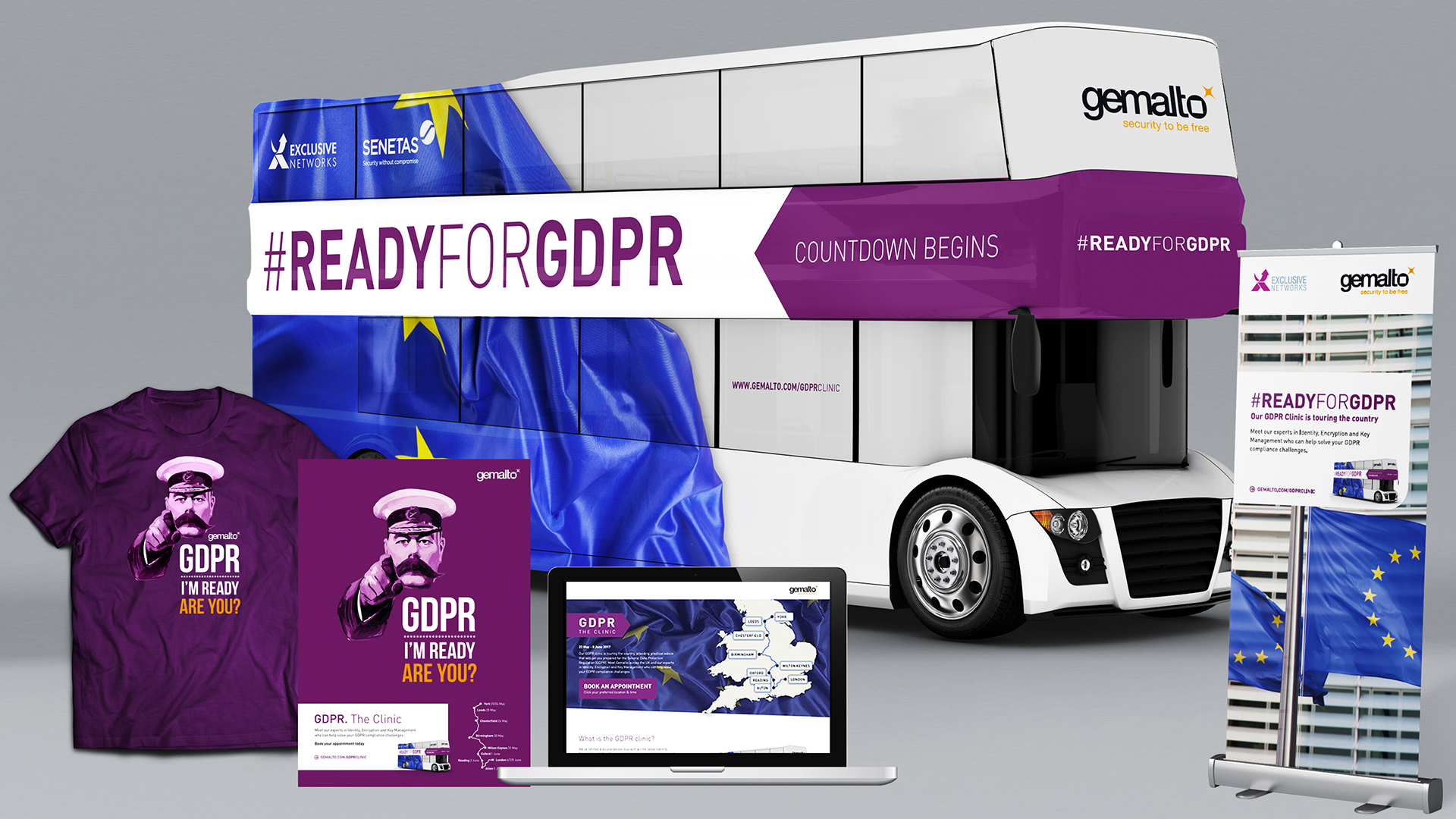
GDPR Awareness Campaign
Campaign / Event
Role: Creative direction, Lead design
Brief
Use the new GDPR regulations to create a campaign to promote how Gemalto can help you become GDPR compliant. Teaming up with the head of marketing, I provided creative direction for the campaign.
Results
Teaming with the head of marketing, we created a roadshow concept where we would brand a double decker bus, touring the UK to generate awareness of the regulations and book meetings with Gemalto sales reps. The campaign was fully integrated with several marketing tactics from organic and paid social media, email, website and partner promotion. We created the hashtag #GetReadyForGDPR and worked with the social team to help drive people to the campaign. We used a technology partner to create a landing page where people could book meetings and track the location of the bus as it toured the UK.
The campaign generated 250,000 Twitter impressions, and 200 appointments were booked throughout the 3 week period and several high profile sales were directly linked to the bus tour.
The campaign has been nominated for several awards, including best integrated campaign for the CIM awards, up for best integrated campaign for a large company at the DandAD awards and best vendor marketing campaign at the CRN awards.
June 18, 2017, Sunday
Product launch campaign design
Campaign
Role: Creative direction, Lead Design, Project Management
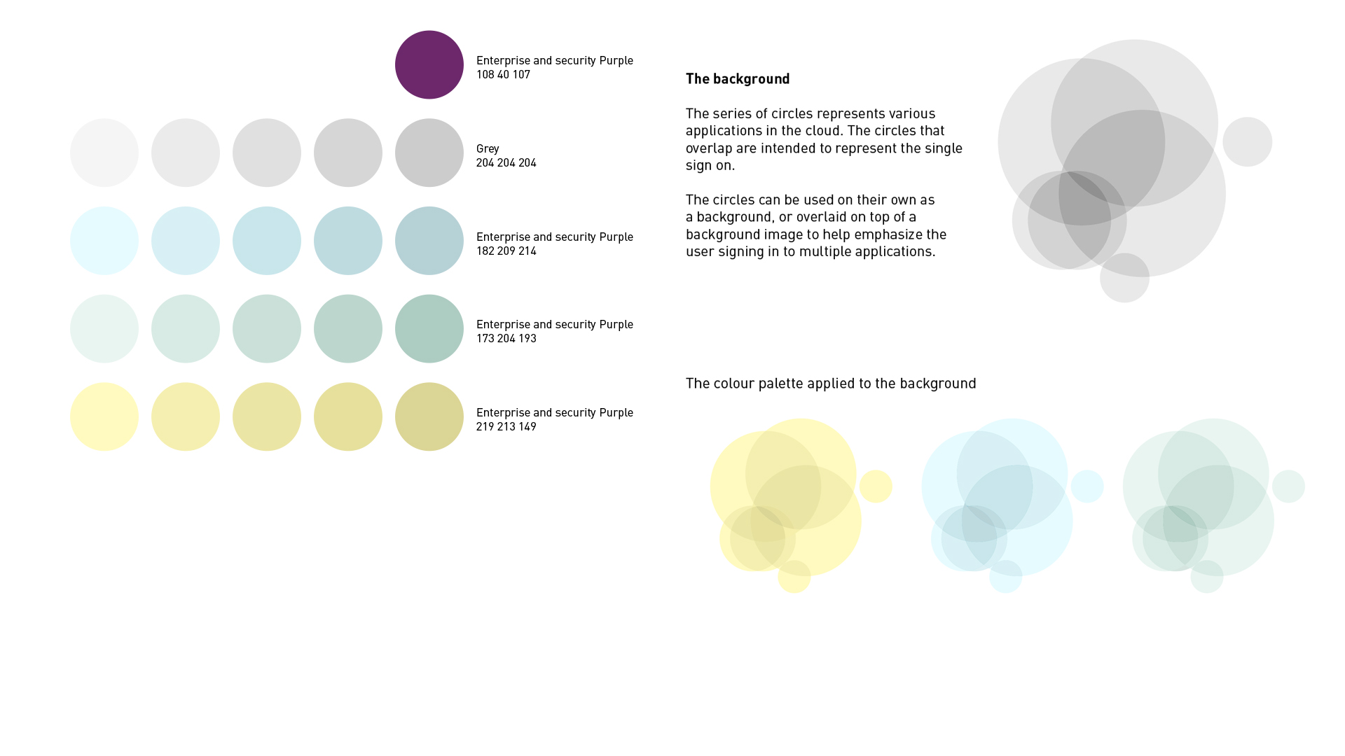
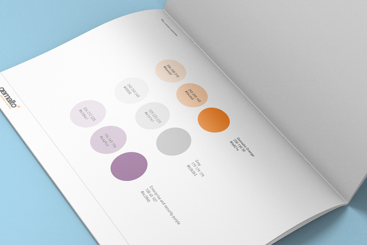
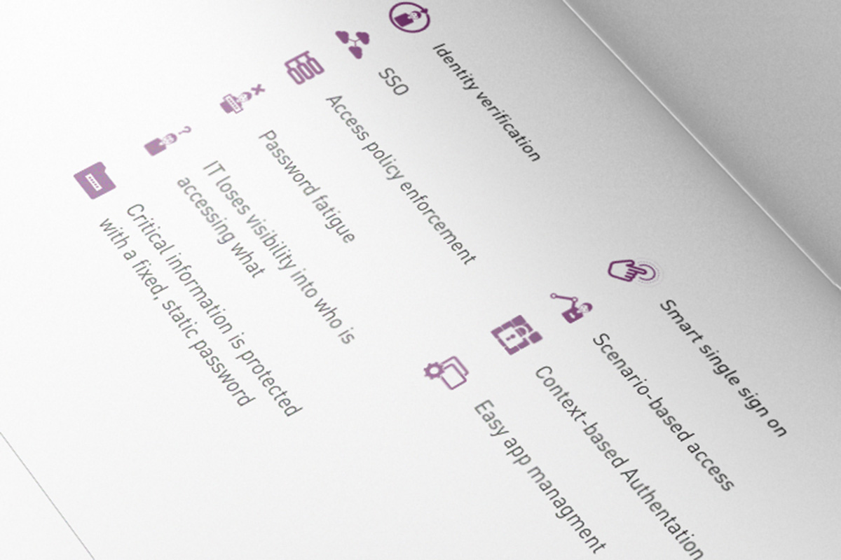
A product launch campaign for Gemalto for an authentication application that enables enterprises to provide single-sign on to cloud applications.
Challenge
Creating a campaign concept that worked under corporate brand guidelines and managing communication between product marketing, field marketing and corporate marketing.
Below shows initial concepts, showing colourway and idea of the concept which was to show that the product allowed you to sign into multiple applications with one sign in.
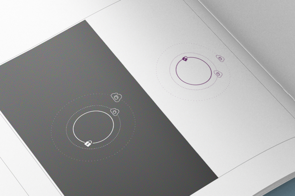
The circles were intended to look like layered clouds and represent the different applications.
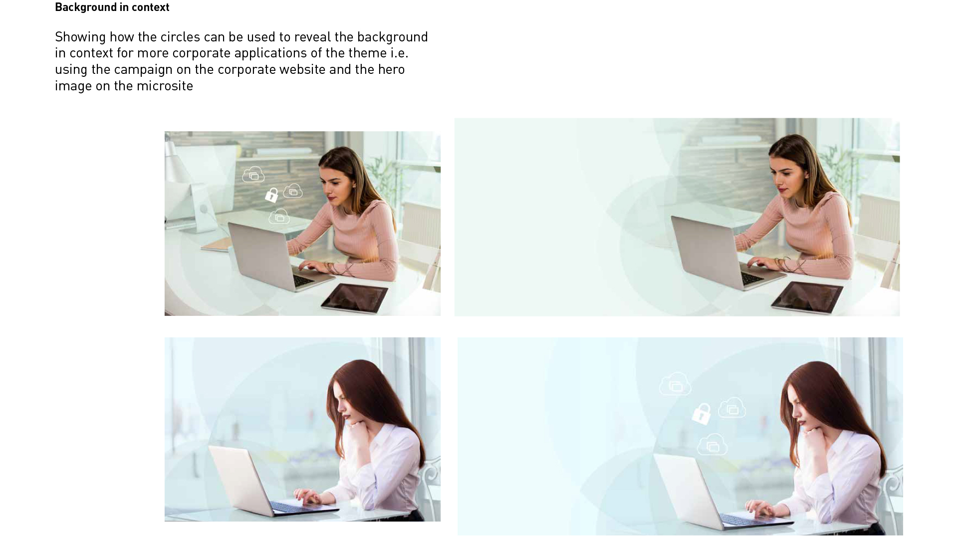
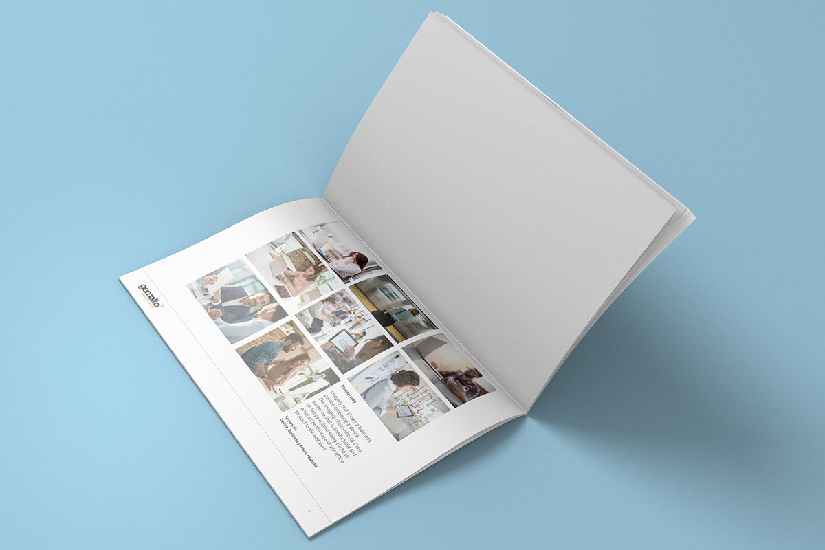
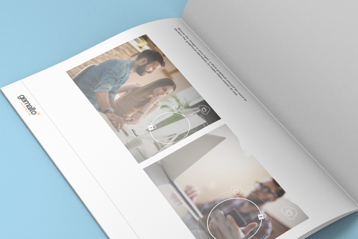
Below shows how the abstract elements combine with photography.
To create impact for display advertising, guidelines were created to use cut out people, making them appear completely on the circle abstract pattern background, to help it lift off the page.
Results
After many iterations and testing, the final concept was delivered with a style guide, a campaign microsite, email design, display advertising across social and paid, presentation decks and iconography.
June 18, 2017, Sunday
A virtual reality experience to make Gemalto stand out from the crowd at high tech trade shows
Campaign / Interactive
Role: Creative direction, User experience, Project management
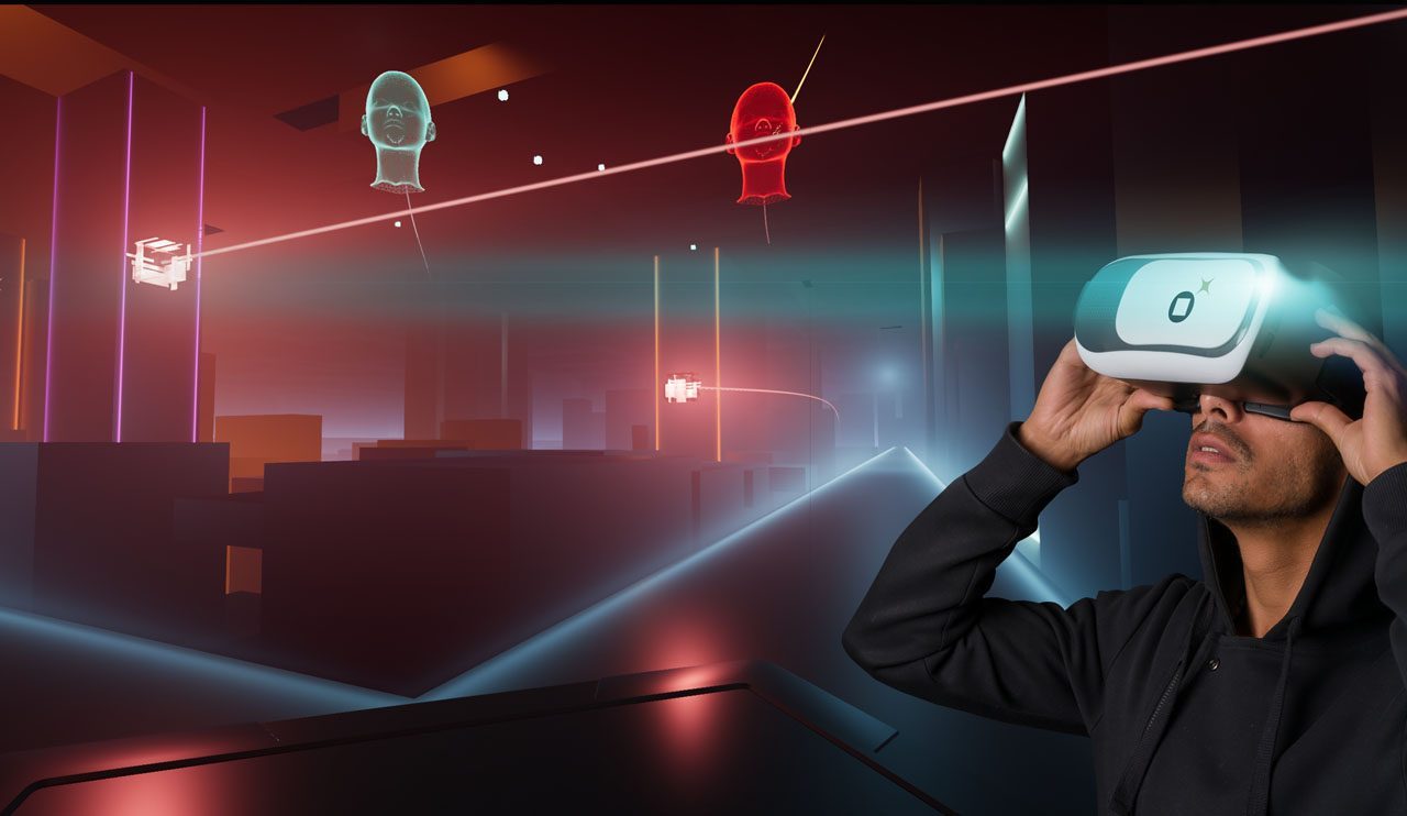
Gemalto; a company in the cyber security industry, wanted to attract attention from visitors at Europe’s largest cyber security event; Info security. Working with the UK Marketing Director, we came up with the idea of creating a custom virtual reality experience to maximise the buzz around the event booth.
Challenge
The main challenge was creating something that would be fun to play, but also relevant to the key messaging. To make this project a success, we needed to create a buzz around it in the industry and go viral.
Approach
After selecting a VR agency, we came up with a theme for the experience that was fun, engaging and had the wow factor as well as being related to the industry. I held regular update meetings with the agency to help steer the creative direction of the experience as well as the UX of the game flow, stepping in on occasion to create elements inside the experience myself.
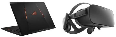
During the development of the concepts, we decided to use a TRON look and feel which not only made the experience feel futuristic, it also helped with 3D processing, as the graphics could be quite simplistic, with no detailed textures bogging down processing speeds. This meant that it could run on a laptop, rather than a large, complicated Rig meaning we could make it go mobile and be easier to ship to different events.
The key objectives to this project were;
Will people have a better understanding of what Gemalto does?
Is it simple enough to play, with minimal instructions? (so language was not a barrier, and simple to pick up and play)
Is it exciting enough for people to socialise it?
Part of this project required buy in internally, so while the game was being developed, i created a teaser video to help sell the idea into the Sales teams and global marketing to create some excitement around it.
Results
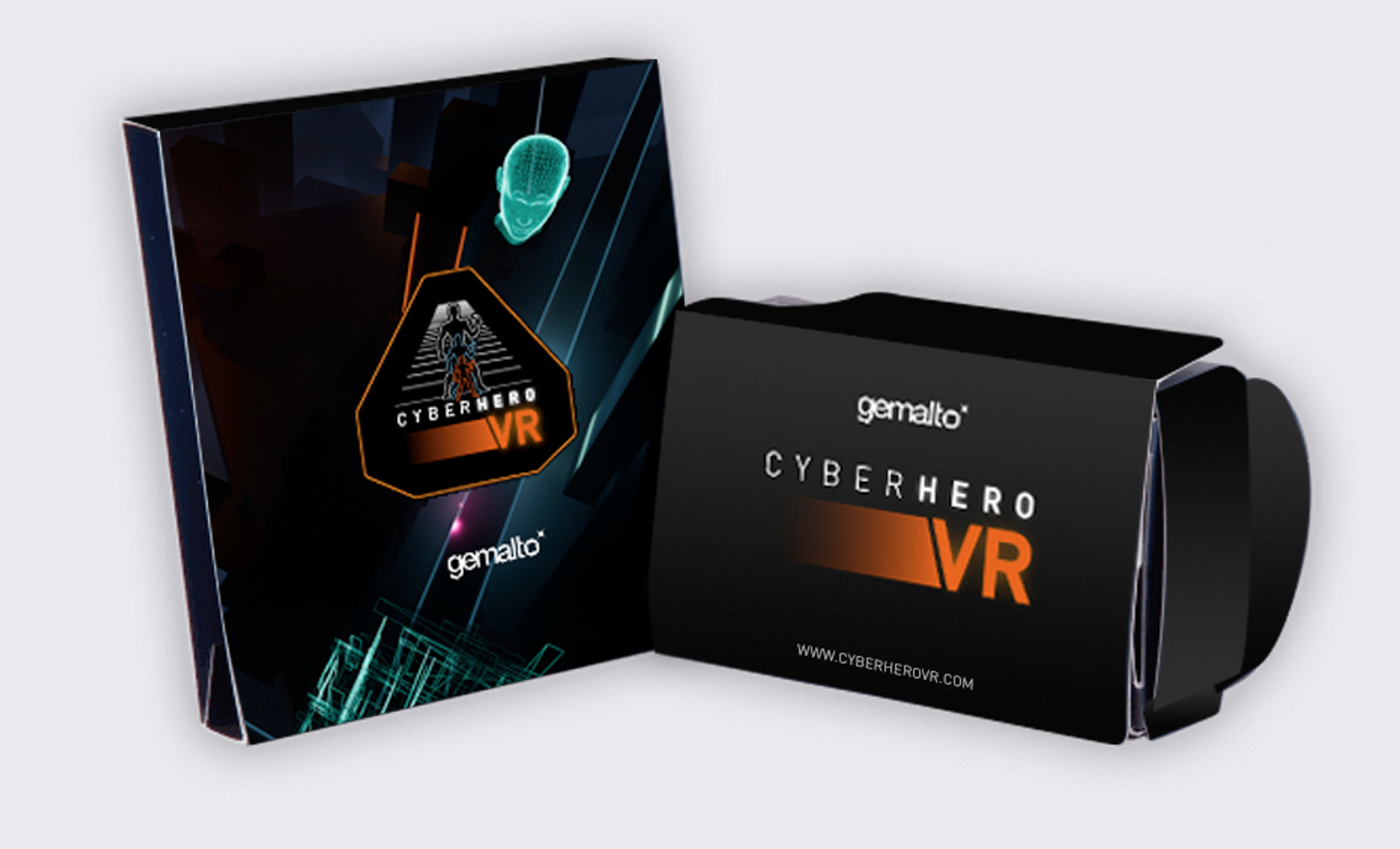
I created a campaign in a box so that field marketing manager could easily take it and have a whole campaign ready to use to promote it at their events. The campaign consisted of a logo, Promotional flyers, email templates, online high score table, hashtag for social, microsite and brand guide. As well as this, we purchased 2 VR laptops and 2x Oculus rift headsets which could then be shipped out to the different regions to use it.
The experience was later brought to mobile so it could be downloaded from the app store and Google Play stores. A PR campaign was created, offering prizes to the top scores that were tweeted using the hashtag #GemaltoCyberHero.
I designed a google cardboard as a giveaway / direct mail piece so people could play the game on mobile using a google cardboard and, working with a web developer, created a microsite that would display the top scores which you can see below