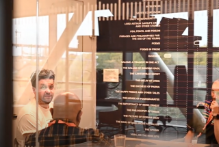
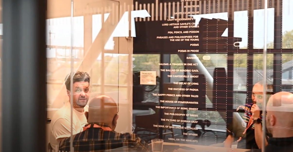
Working with the UK Marketing manager, I filmed and prduced a customer event highlight video. I worked with the customers and sales team to secure interviews to make the video successful. I later created a follow up video with customer quotes which the company could use as customer testominals.
Read More
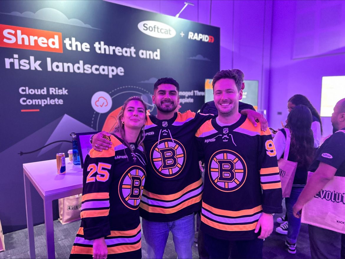
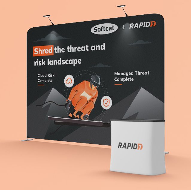
Working with an account executive at Rapid7, I concepted an event design for the Softcat Partner Kick Off. I wanted to create something that pushed the Rapid7 brand guidelines so it stood out against all the other cyber security vendors at the event, but also promote the current incentive program (ski trip). Working with the content team, we came up with the line 'shred the threat and risk landscape'.
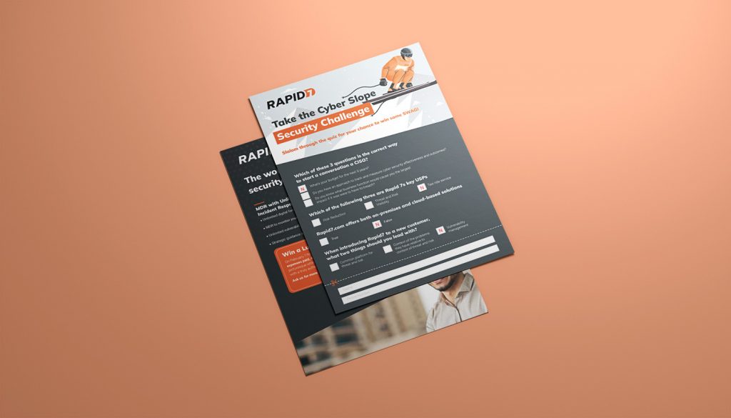
During a brainstorming session, I suggested instead of giving away SWAG, we could get sales people to interact with the brand and give them the opportunity to win swag by answering some multiple choice questions. This turned into a mini sales training test as I worked with the business development team and the regional CTO to devise questions on their knowledge of Rapid7 products and created a multiple choice quiz on a flyer.
Working closely with the Channel Sales Director and Marketing Director, I produced, filmed and edited a partner event highlight video which was used to promote the Thales partner program
Thales commissions research reports every year and required a new theme for the 2023 versions.
Challenge
The main challenge was that this year they were going to slice the data up to create multiple reports targeted at different industries (verticals) as well as different markets (authentication and encryption). Creating a template that would be easy for designers in the team to work with and also something that would work across different vertical markets and discuss different solution areas but look like they were from the same family of reports was the biggest challenge.
Approach
My first step was to look at any issues and feedback that was had from the previous years reports, and a common theme was that the report was harder to read online. The previous report was set up to be printed, but the reality was that most people just read it on their device. For this reason i removed the multiple column layout, increased the font size and also made sure any spreads (if printed) would also work as single pages. In addition to this the diagrams also became full width and easily editable within indesign, helping the production time faster.
There was also feedback that a lot of the images used in the previous reports were not diverse enough and it created a lot of back and forth when being reviewed by stakeholders, so the new design featured less photography, and more graphical elements.
Results
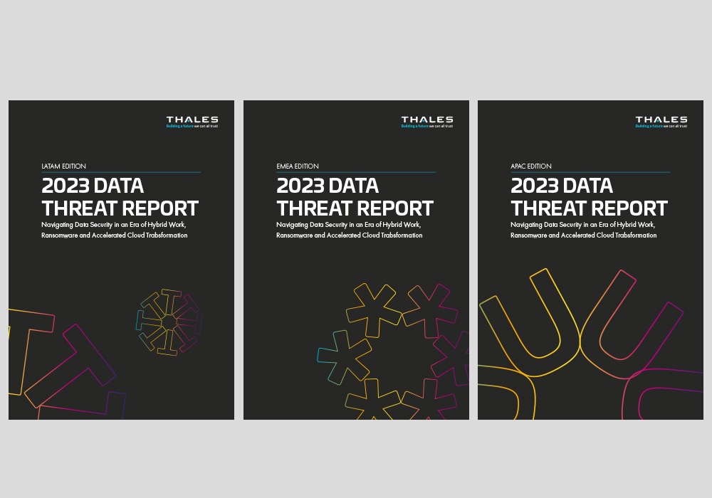
Research report cover design options
I developed a theme that would work across regions and verticals, based around using the corporate secondary colour palette and applying it to abstract characters that represented data. Using a different graphical approach to each cover distinguished it from the other. I also applied different background colours for the vertical reports, so instead of dark grey, a blue would be used for example.
Cover design
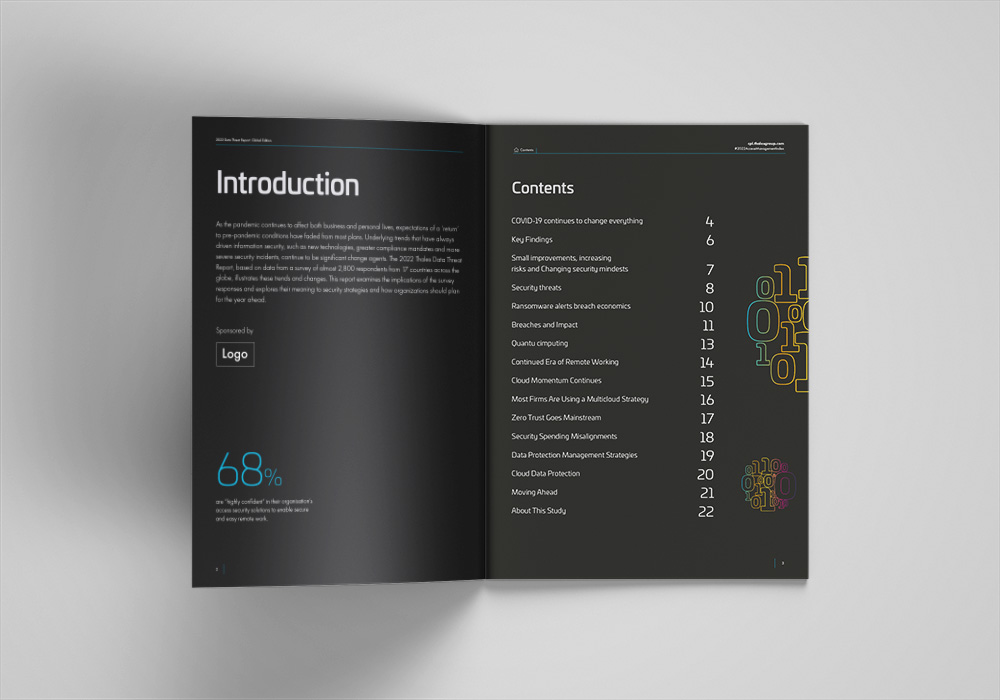
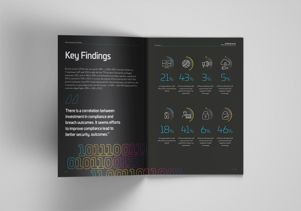
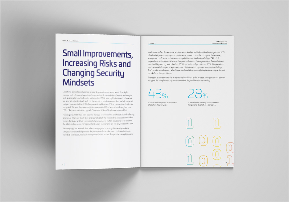
Inside spread showing contents pages and where sponsorship logos would be placed
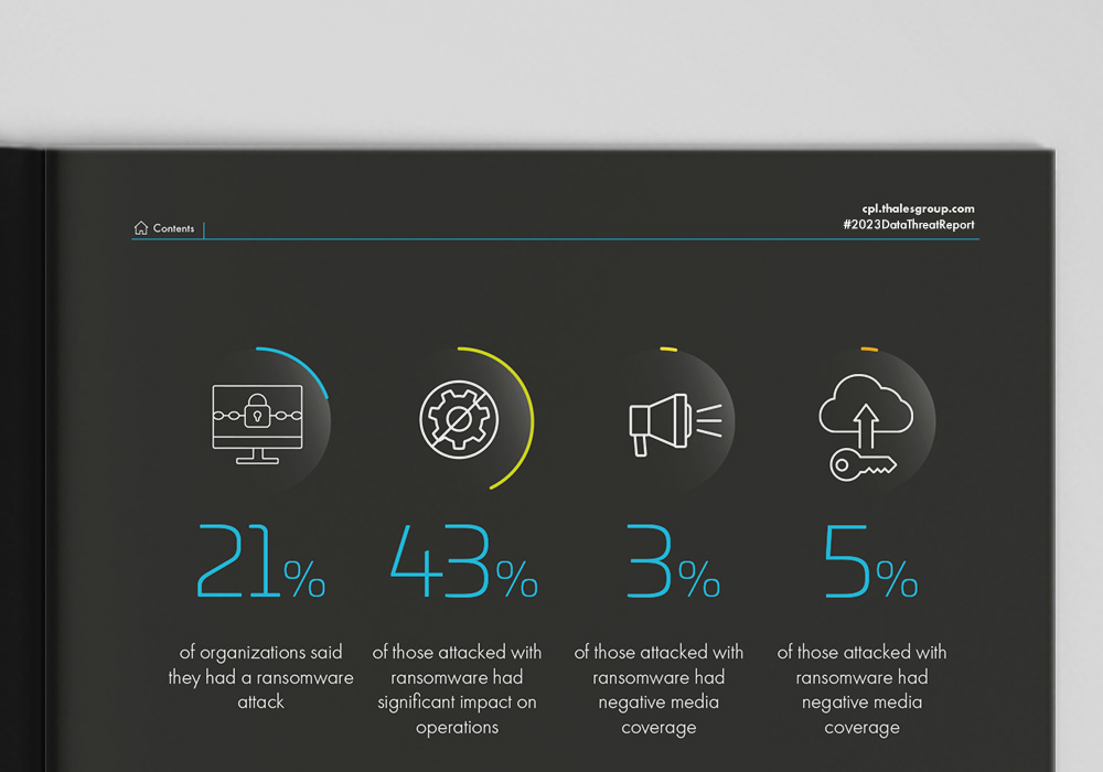
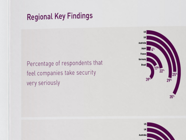
Inside spread design showing how the key facts would be displayed in infographic format to keep the content lighter and more easily digested
A lot of the posts for Thales were starting to look the same in the linkedin feed, they wanted something that stood out. Collaborating with the social media manager, we updated content to work better in a social feed and expanded the colour palette to create a slider that would generate more engagement
Working with the Thales social media manager, I art directed a fun interactive social post, where the user had to catch a screenshot of the data inside the lock. This simple idea proved to be the most viewed social post by Thales in 2022
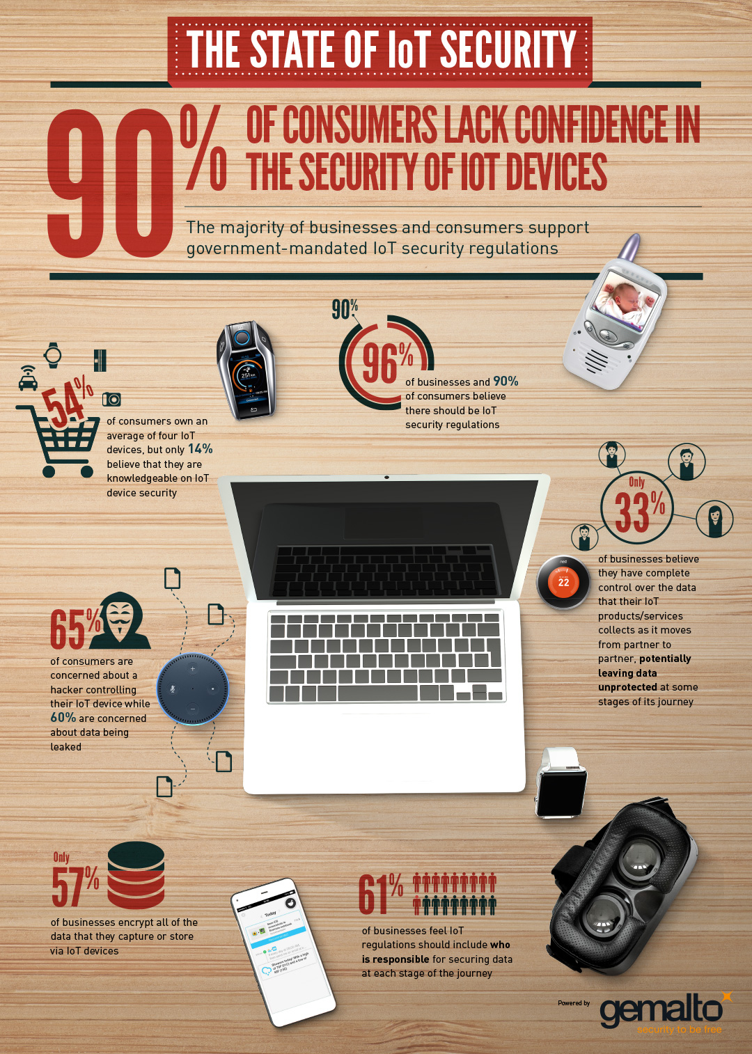
Gemalto approached me to create an infographic to highlight key stats from a consumer research report they had run. The project included laying out a report and an infographic. The research focused on security of IOT connected devices and the public perception of that.
I worked directly with the PR manager on producing concepts and advised on how many points should be displayed and revising content to make the piece work better as an infograohic and below is the final piece.
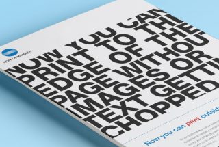
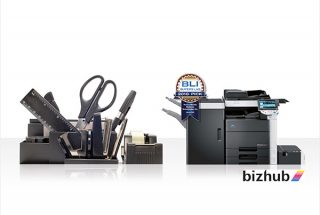
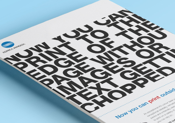
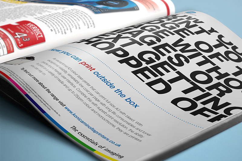
Creating awareness of a new A3 colour laser printer to the the creative industry. Konica Minolta genuinely had the best quality A3 printer in the industry and needed to get the message out there. They approached me to create an advert for Mac World, Mac User, Computer Arts and Creative Review to help raise awareness. I came up with several concepts, each focusing on different USPs of the printer, but the the selected concept focused on its ability to print to the edge without a border. The advert generated a lot of interest and the company received great feedback from the target audience as a result of this advert.
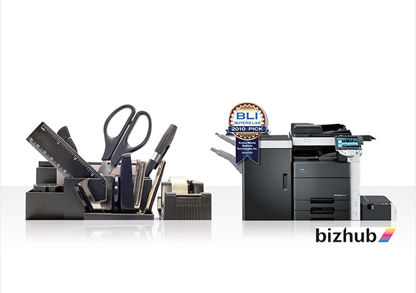
Konica Minolta required an co-branded print advert for a trade magazine which was co-funded by the partner and Konica Minolta. The advert copy was initially supplied to me and i visualised several concepts and came up with a new headline for the advert. The selected concept can be seen below.
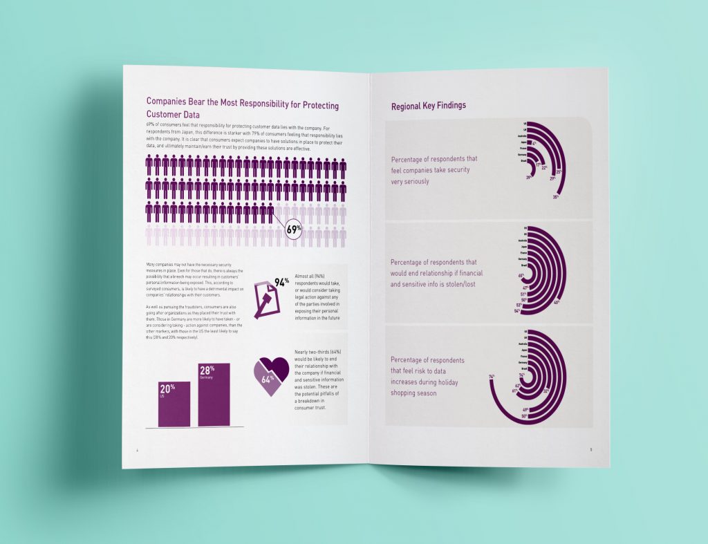
I designed a report showing the results from a global research piece aimed at the retail industry. I created infographic elements to make the complex data easier to digest and more interesting to digest and used imagery related to retail to make it more relatable to the target market. in addition to careful colour selection to make it an easy to read document.
My role: Art direction, designer
[caption id="attachment_19721" align="aligncenter" width="600"][/caption]
Read More