Role: UX / UI design
Increase engagement on the research web pages of the Thales corporate website.
Research
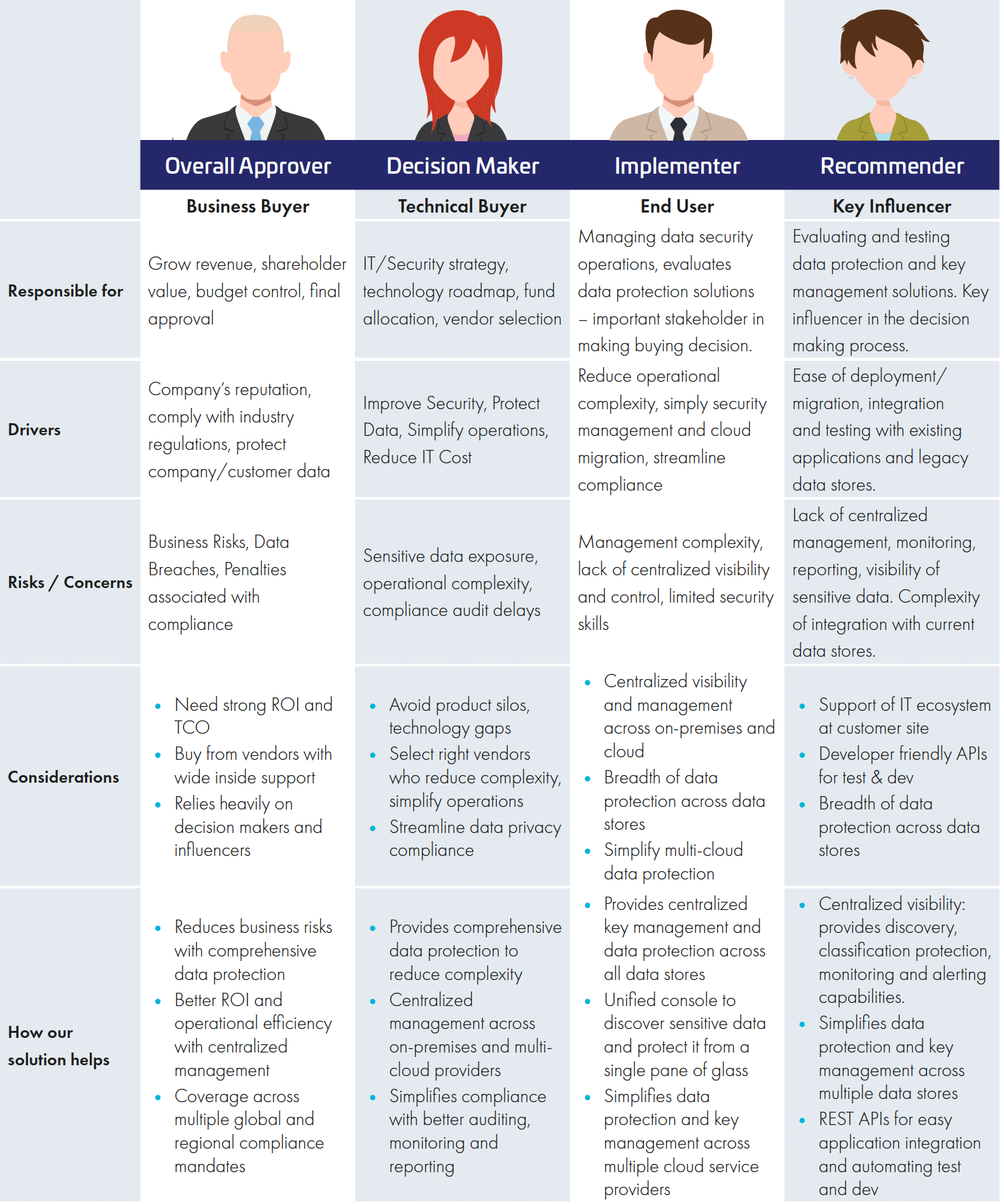
Before assessing the existing performance of the page and performing a UX audit, I identified 4 user personas that would access the site;
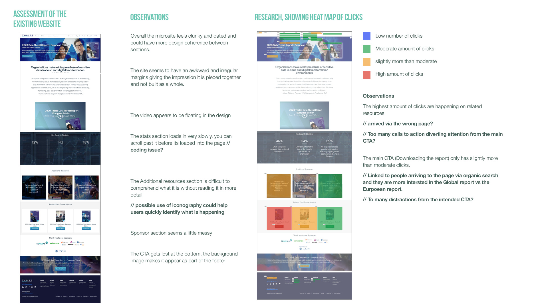
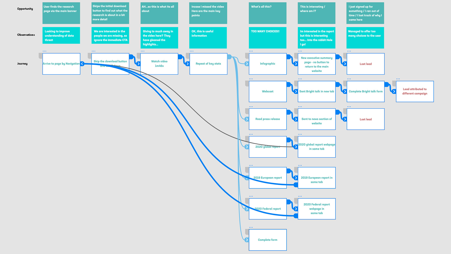
We then analysed the page using Hotjar and mapped out the different user journeys. We quickly identified that there were multiple routes off the page as soon as you entered it. It became clear that the focus of the page needed simplifying and organising in a way that would lead the customer through a journey in a structured way, to a clear CTA. I started by making a list of observations on the page based on some stats from HotJar:
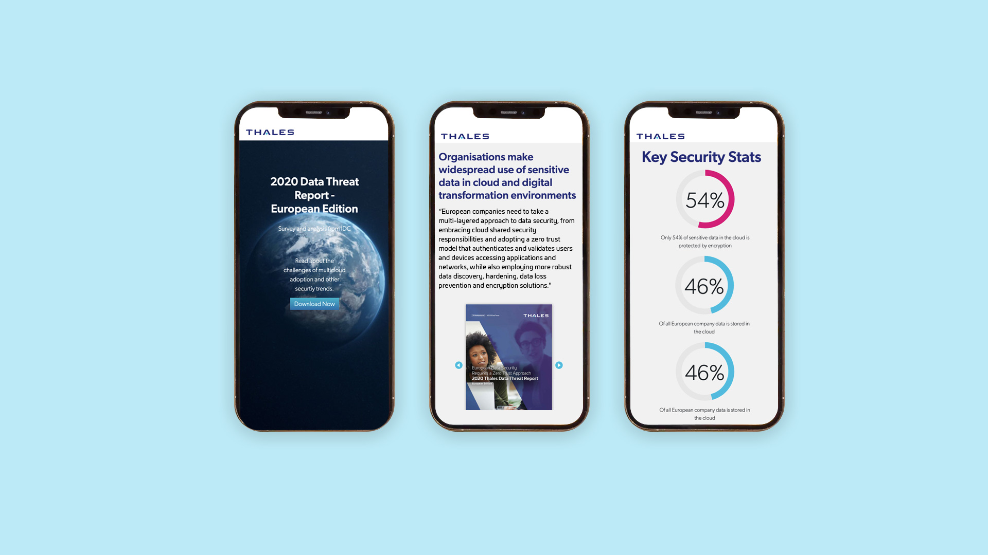
To improve engagement on the page, i designed an animate-on-scroll banner, so as you scrolled down the page, a short animation would lead you through the contents. Other highlights included a amazon style flip book of the first few pages of the report, to tease people and incentivise them to download the full report and infographic style stats that would animate on load. All this was created in the most efficient way to keep the page feeling quick and nimble
